Dr Phil Brooker reflects on his recent experience of introducing early career researchers to the visual analytic approach
On October 30th, I got the chance to facilitate a 3-hour workshop on doing social media analytics with Chorus, and I’m happy to report that it was a great success!
The workshop formed part of a wider two-day training module, ‘Hearing, Seeing, Doing: Reflexivity, Creativity and Collaborations in Research’, for doctoral students across GW4 universities. The wider course was designed to engage early career researchers in thinking differently about the research process, and the Chorus team was drafted in to lead a workshop on a creative non-traditional/alternative methodology.
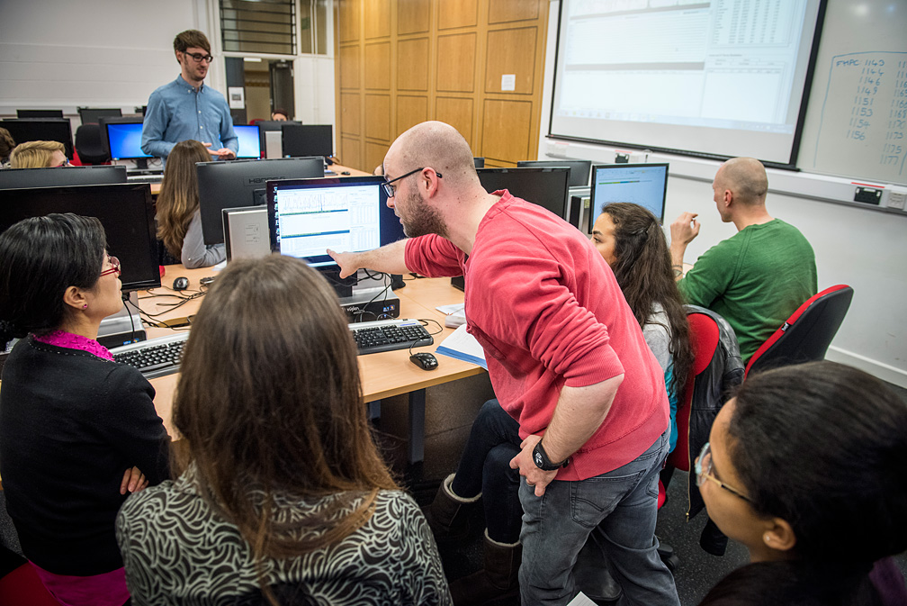
Phil Brooker guides students on using the Timeline Explorer
Reflecting on the use of Chorus as a pedagogical tool, I think the combination of visual models of data and the functions that help users navigate around that data to get back to original tweets was something that students could really get their teeth into. I started the workshop with a talk that set out a ‘visual analytic’ approach to social media data, wherein the visualisations you can see on-screen are not to be viewed as results, but as part of a data exploration process which can lead you back to interesting insights from the original data. From here, students were given chance to use Chorus themselves, first to explore a mock dataset and get a handle on how Chorus operates, then to undertake some data collection and visualisation work themselves on topics relevant to their own research. With the visual analytic approach in mind, the students seemed to get a lot out of probing the Twitter API for interesting data, then finding their way around it with the various visual models Chorus builds. I was careful to emphasise that there’s no such thing as ‘bad data’ – if they were having trouble drawing insights from the data they captured, I encouraged students to see this as an opportunity to learn what was lacking in their data collection strategy and see if they could use that information to go back and collect data better suited to addressing their questions. The interplay between data collection and data visualisation that Chorus offers made this a straightforward process, with students being easily able to switch between the two and reflect on how the data collection and visualisation process itself formulates part of their research as a ‘socio-technical assemblage’.
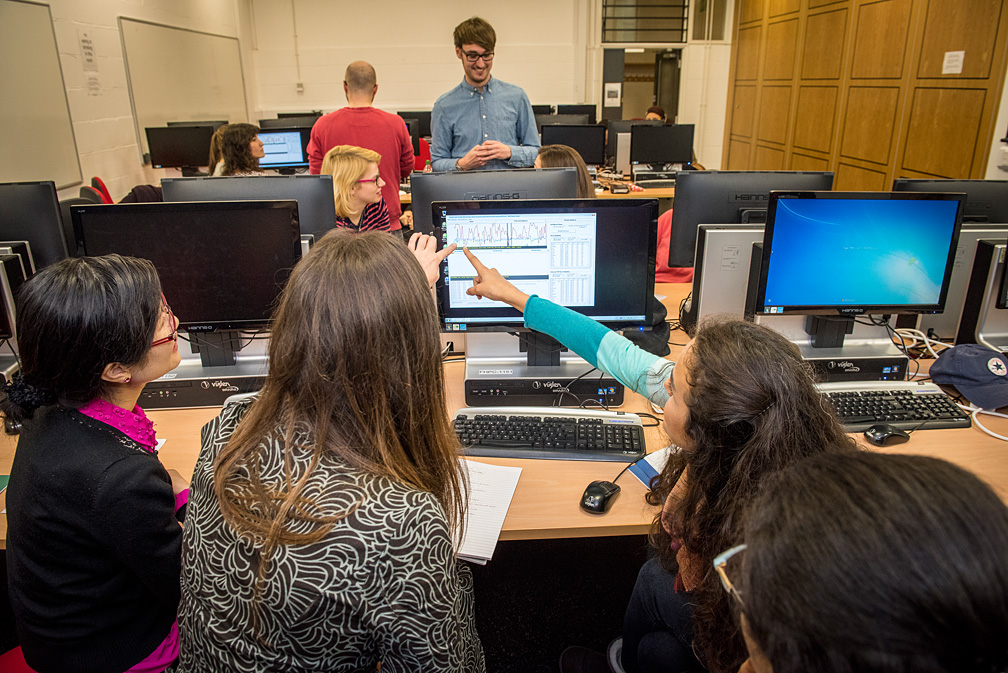
Students soon got to grips with the visual analytic approach
All in all, Chorus proved to be a useful tool for not only demonstrating how to capture and visualise Twitter data, but also for showing how to discover insight and master the research process as it moves between human and computational control. This seems to me to be a great asset to the software – it not only has a use as a tool for undertaking research work in social media analytics, it can help researchers see and understand the underlying methodological thinking that that research work embodies, allowing for a deeper exploration of the topic at hand.
If anyone is interested in using Chorus as part of their teaching, or in hearing more about the workshop course mentioned above, please do get in touch at team@chorusanalytics.co.uk.
Leave a Reply
You must be logged in to post a comment.